
Styling and Layout
The Design Tab in the Canvas section of the Kajoo app allows you to customize and style your components for better presentation and functionality. It provides tools to adjust layout, typography, spacing, size, and more, helping you design components to match your project’s needs. This guide will walk you through the key features and functions of the Design Tab.
Styling and Layout
The Design Tab enables you to customize your components by adding styles, adjusting layout properties, and applying different design states. Here's how you can use the tab:
1. States Section
Within the Design Tab, you have the option to define different interaction states for your components. The States section allows you to add the following:
-
Hover: When a user hovers over the element.
-
Focus: When the component gains focus (e.g., through keyboard navigation).
-
Focus-within: When any child element of the component gains focus.
-
Focus-visible: When the component is focused and the focus is visible.
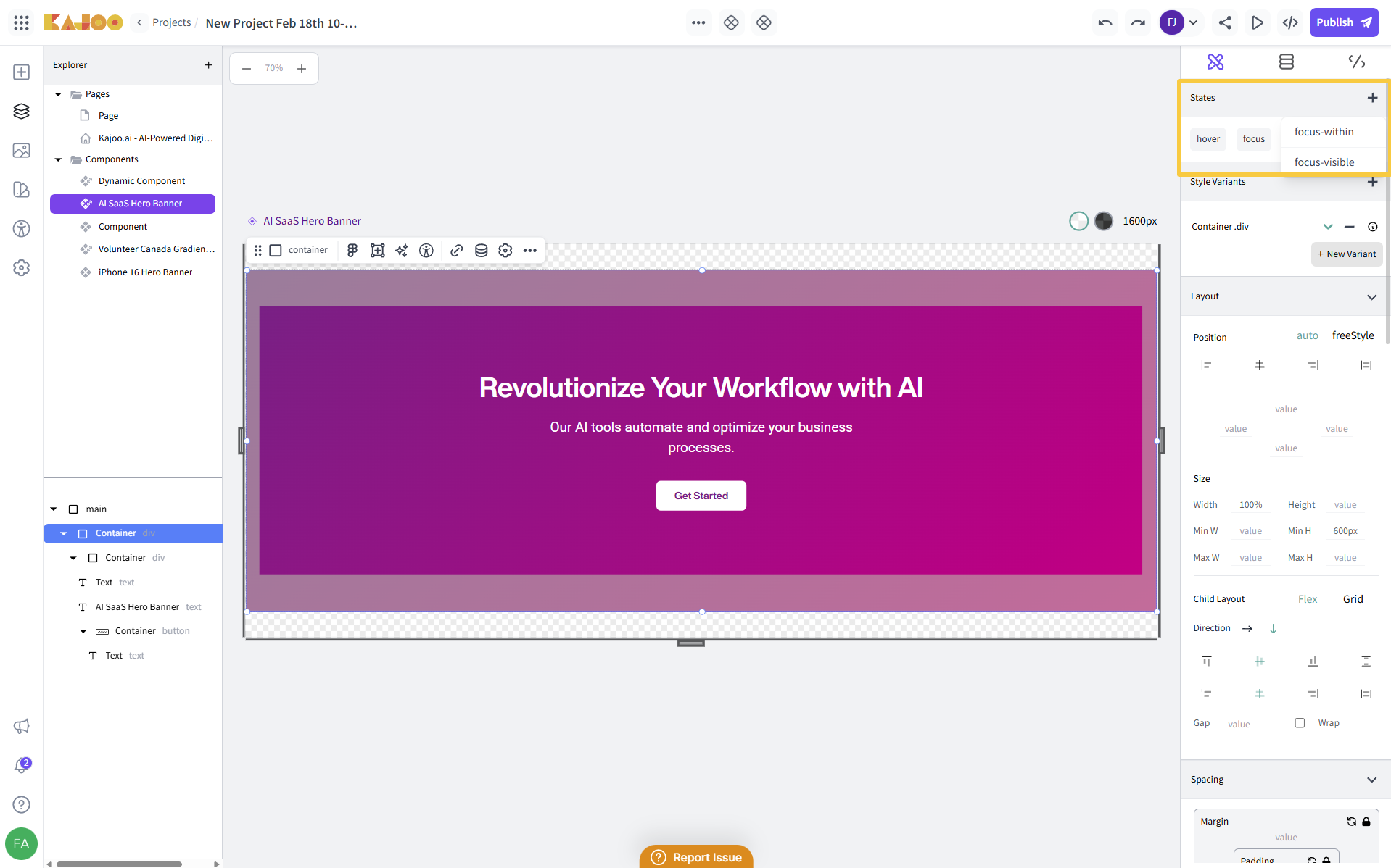
These states allow you to apply specific styles when users interact with your component, improving the UX.
2. Adding Style Variants
To create different styles for your components, use the Style Variants section:
-
Style the component first, adjusting properties like color, size, typography, etc.
-
Once satisfied, click the New Variant button to save the style.
-
Provide a name for the variant and a tag to categorize it.
-
The style variant is then created within the theme being used in your project.
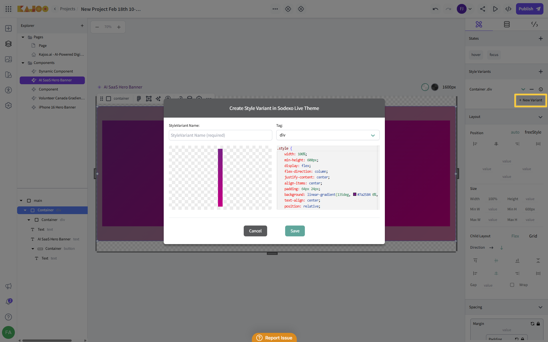
This process differs from the Theme section, where styles are applied before saving. Style variants allow you to apply distinct designs to different instances of the same component, giving you flexibility for varied use cases.
3. Layout Section
The Layout Section enables you to control how elements within the component are positioned:
-
Auto Positioning: When selected, elements automatically snap into place based on the container’s defined properties.
-
Freestyle Positioning: By disabling auto-positioning, you can manually position elements using CSS properties such as top, left, right, and bottom. This provides precise control over element placement using absolute positioning.
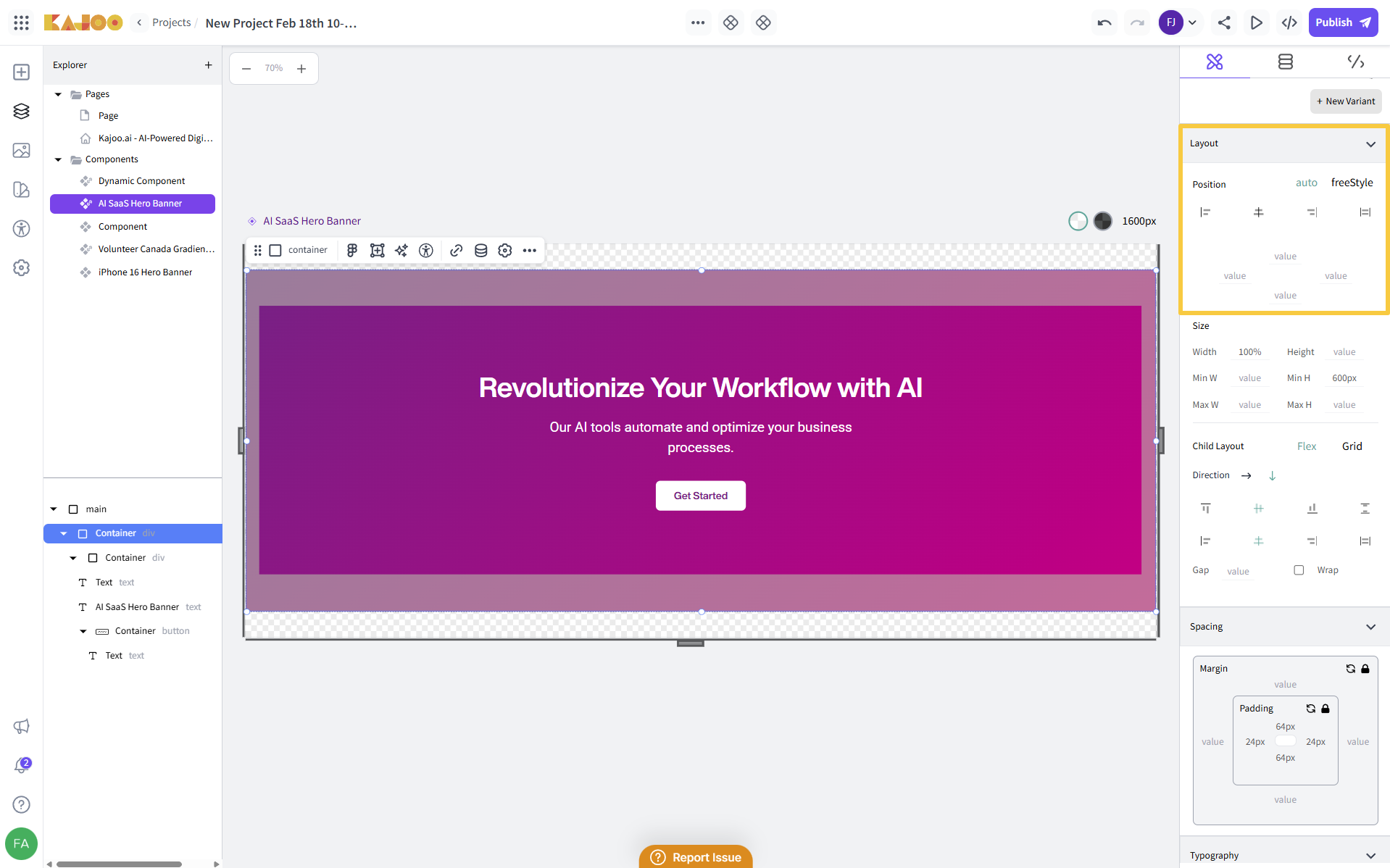
4. Size and Dimensions
You can modify the size of your component by adjusting its:
- Width and Height: Set explicit width and height values for your component.
- Min and Max Width & Height: Define constraints on how small or large the component can be resized, ensuring responsiveness.
5. Child Layout Options
In the Child Layout section, you can define how child elements are arranged within the container:
- Flex: Use flexbox layout for responsive alignment and distribution of items.
- Grid: Use CSS Grid to arrange child elements in a two-dimensional grid structure.
This section provides flexibility in arranging child components based on your layout needs.
6. Spacing Section
Spacing is crucial for maintaining a clean and well-organized layout. The Spacing Section allows you to adjust:
- Margin: Control the space outside the component.
- Padding: Control the space inside the component, between the content and the border.
You can also lock the spacing settings by clicking the lock icon, which ensures that all the spacing values remain the same when locked.
These adjustments ensure that your component has proper spacing relative to other elements.
7. Typography Section
The Typography Section lets you fine-tune the text presentation of your component:
- Font Family: Choose the font family to apply to the component's text. (Additional font families can be added in the Themes → Fonts section).
- Font Weight: Set the font's weight (e.g., regular, bold).
- Font Size: Adjust the text size to fit your design.
- Line Height: Control the spacing between lines of text.
- Text Color: Change the color of the text (explained in the next section).
- Text Style: Apply additional text styling, such as italic or underline.
- Text Alignment: Set the text alignment to left, right, center, or justify.
- Text Transformation: Change text to uppercase, lowercase, or capitalize.
Additionally, for text colors, you can use tokens to make it easier to manage and apply consistent color schemes across your design.
8. Visibility Section
You can adjust the visibility and transparency of components through the Visibility Section:
- Display: Control whether the component is displayed or hidden.
- Opacity: Adjust the opacity of the component for transparency effects.
These options help in controlling how visible the component is within its parent layout.
9. Background Section
In the Background Section, you can modify the background of your component:
- Background Color: Select a color to fill the component’s background.
- Background Image: Upload or link an image to use as the component’s background. You can also set the background image directly from Unsplash, which is available in the gallery on the Kajoo’s left-side navbar within Canvas.
These settings help in creating visually appealing components by adding colors and images as backgrounds.
10. Border Section
In the Border Section, you can define the borders of your component with various customization options:
- Type: Choose the border style for the component. Available options include:
- Solid: A continuous line.
- Dotted: A series of dots.
- Dashed: A series of short dashes.
- Double: Two solid lines with space between them.
- Groove: A 3D grooved effect.
- Width: Set the thickness of the border (e.g., 1px, 2px).
- Radius: Adjust the border radius to create rounded corners for your component. You can define specific values for each corner or apply a uniform radius across all corners.
- Color: Choose the color for your border to match your design.
These options allow you to style the borders of your component and define its visual boundaries effectively.
11. Flex Properties Section
The Flex Properties section provides control over the flex behavior of items within your component when using the flexbox layout. The following fields are available:
Flex: Define how the flex item grows, shrinks, or stays fixed in proportion to its siblings within the flex container. You can enter values such as:
- None: The item does not grow or shrink.
- Auto: The item will automatically adjust to fill available space.
- Grow: Specify how the component should grow relative to other items in the container. For example, a value of 1 means it can grow to fill space.
- Shrink: Define how the component should shrink when there is not enough space. A value of 1 indicates it will shrink proportionally with other items.
- Basis: Set the initial size of the component before any growing or shrinking occurs. The value can be in any valid CSS unit (e.g., px, %, em).
- Order: Adjust the order in which the component appears within the flex container. Components with a lower value are displayed first, and those with higher values appear later.
These properties provide detailed control over the arrangement and responsiveness of components in a flex container.
12. Accessibility Section
The Accessibility Section is designed to improve the usability of your component, especially for users relying on assistive technologies. The following fields are available:
- Tab Index: Set the tab index to control the order in which the component receives focus when users navigate through the page using the Tab key. A lower value (e.g., 1) will make the component accessible earlier in the sequence.
- ARIA Attributes: Add ARIA (Accessible Rich Internet Applications) attributes to enhance accessibility for screen readers and other assistive technologies. For each ARIA attribute:
- Enter the Name (e.g., aria-label, aria-hidden, etc.).
- Enter the Value associated with the ARIA attribute (e.g., a label name, hidden status).
We also recommend using the Accessibility Checker feature, which helps you review your component for accessibility issues and ensures that your components are accessible to users with disabilities.
13. Attributes Section
The Attributes Section allows you to define additional custom attributes for your component, helping with its functionality and identification in the HTML structure. The following fields are available:
- ID: Assign a unique ID to your component for referencing it in JavaScript or CSS. This helps in uniquely identifying and targeting the component.
- Name: Define a name for the component, which can be used for identification or linking to other elements.
- Tag: Specify a tag to categorize or label the component, assisting with organization and grouping in your project.
- HTML Attributes: Add any other standard or custom HTML attributes needed for the component.
Updated 10 days ago