
Creating Style Variants
What Are Style Variants?
Style Variants allow you to define multiple visual styles for the same element type (such as buttons, text, or containers). For example, a button element can have Primary, Secondary, and Tertiary style variants — each with unique colors, sizes, and interactive states (like hover or focus). By using style variants, you maintain flexibility and consistency in your design without relying on a component-based system.
How to Create Style Variants
1. Select an Element:
-
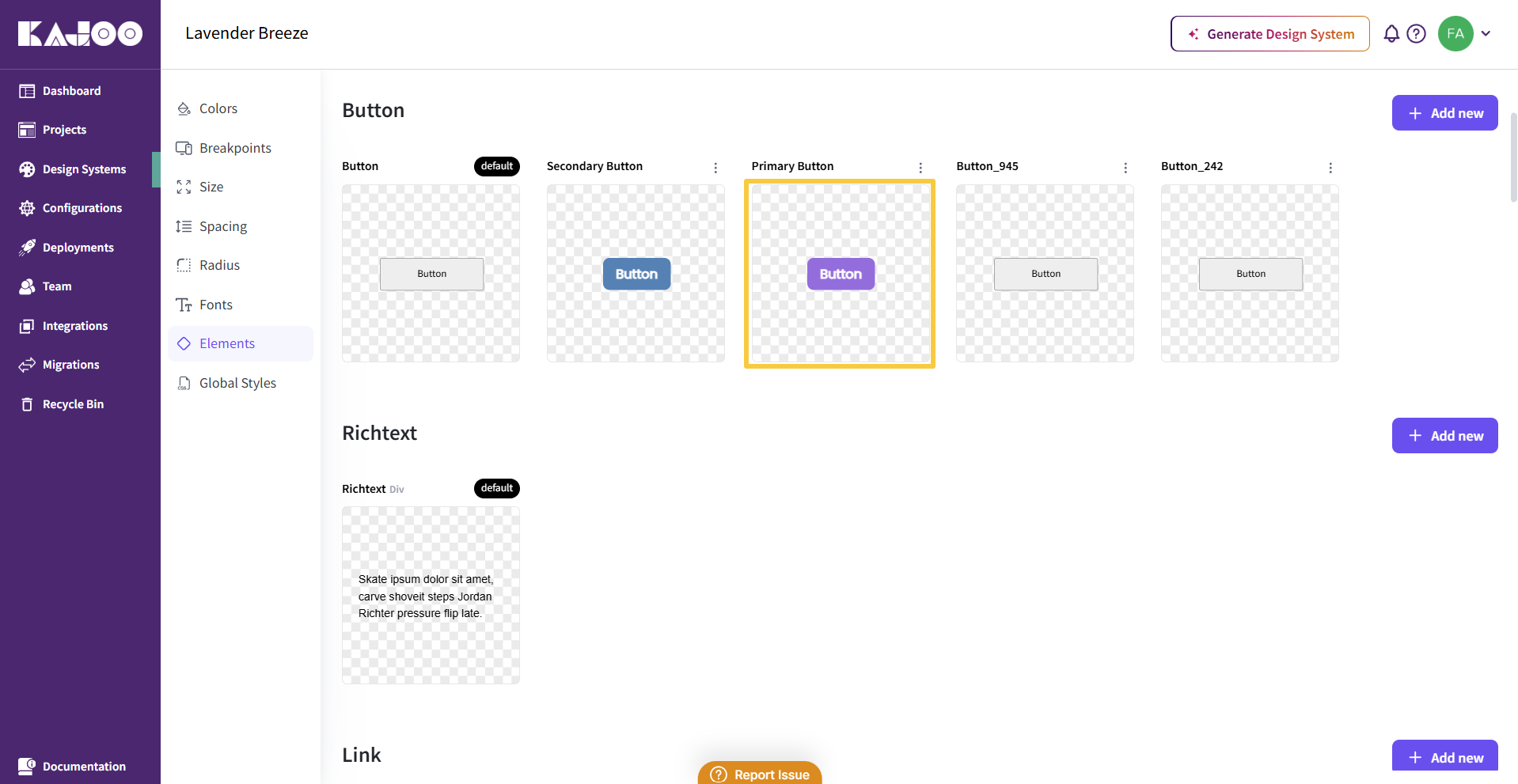
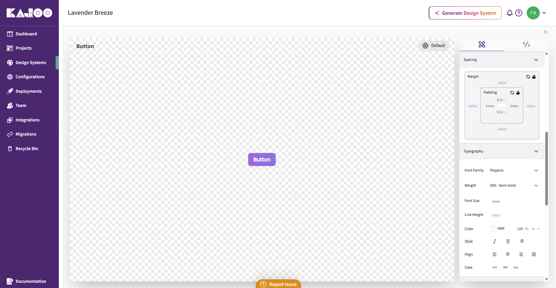
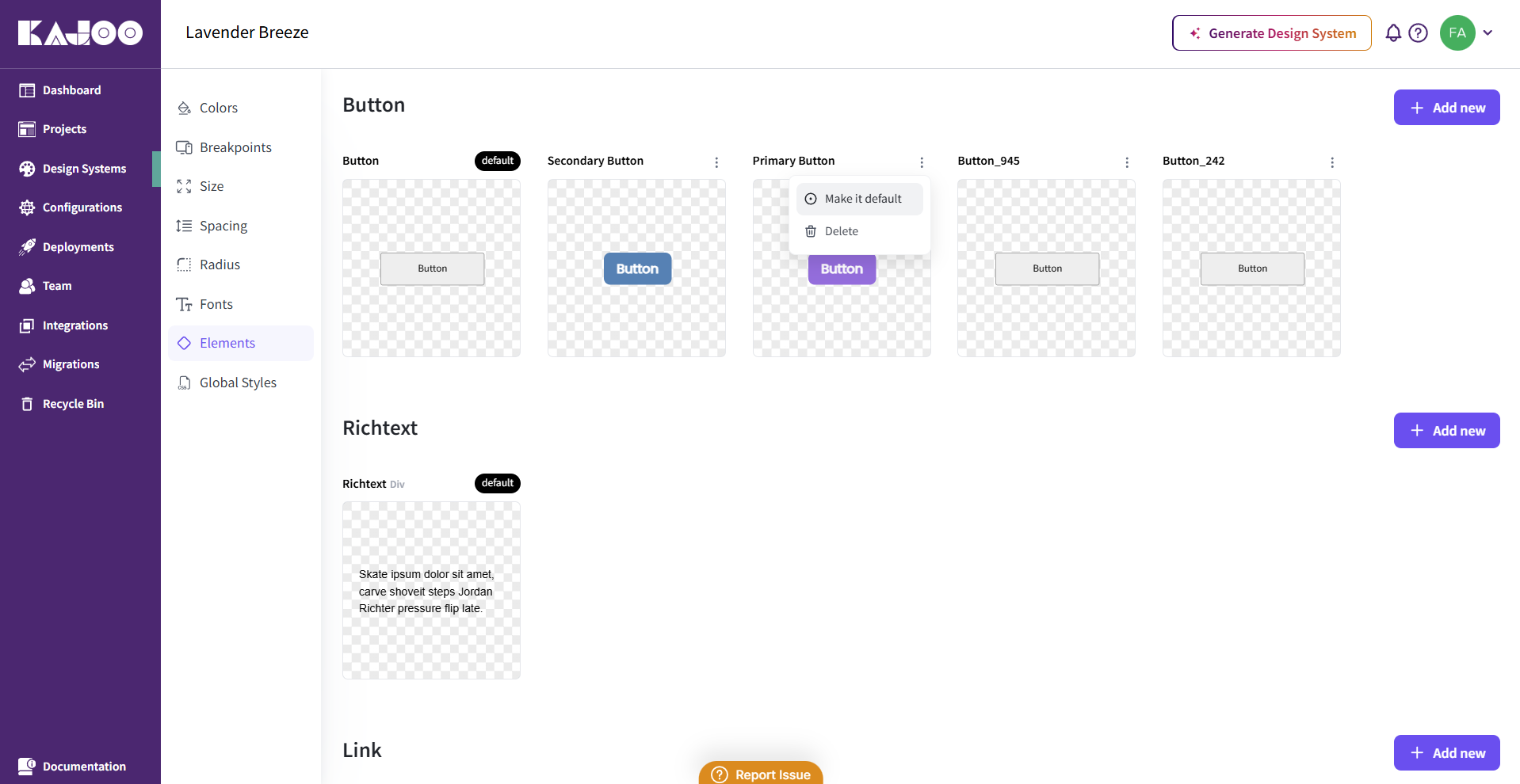
Go the Elements section and choose the element you wish to style (e.g., a button or text element) from the design system by clicking directly on it.
-
In the editor, you can view and modify the details for your style variant.
2. Creating a Style Variant:
Define the Variant Name:
-
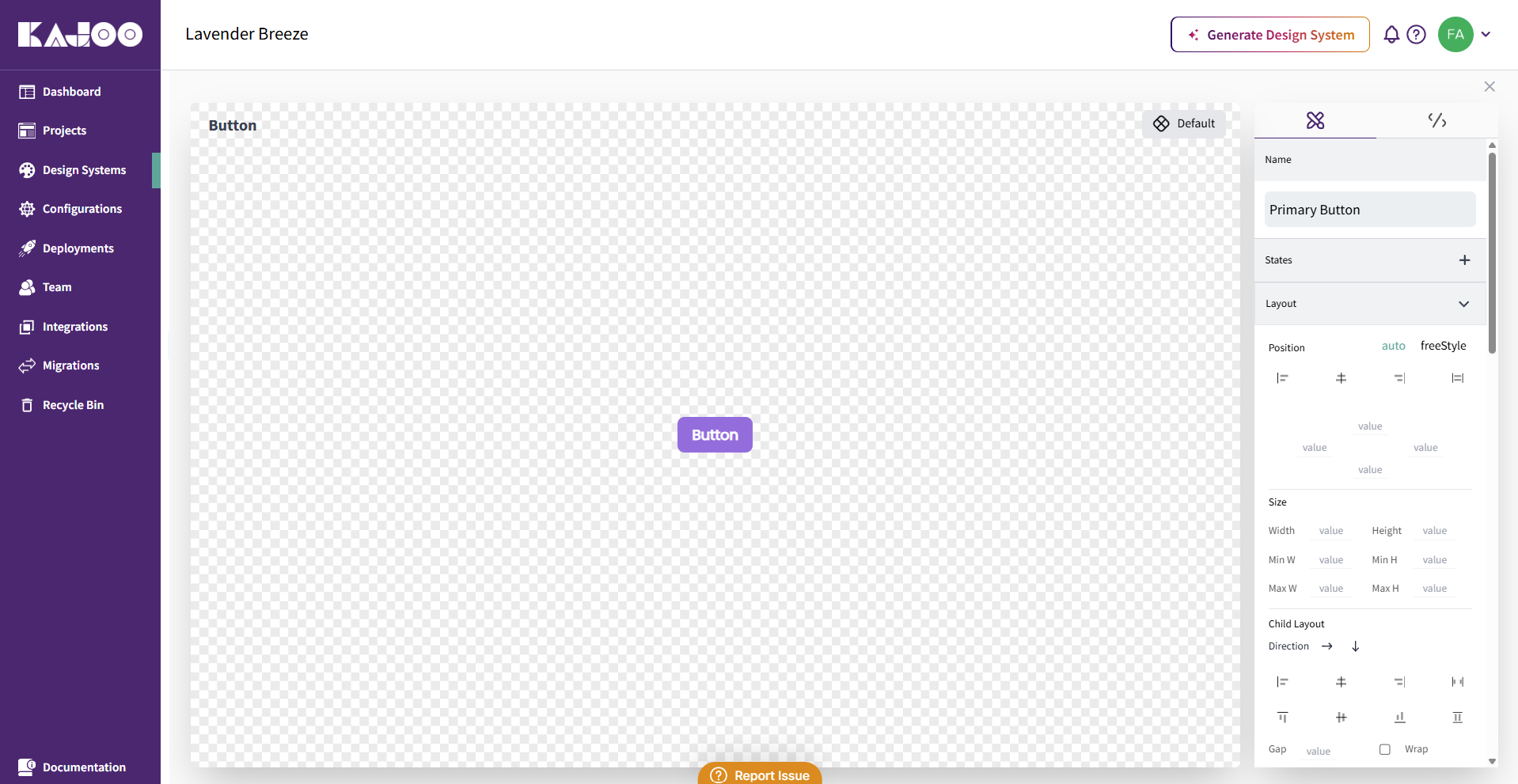
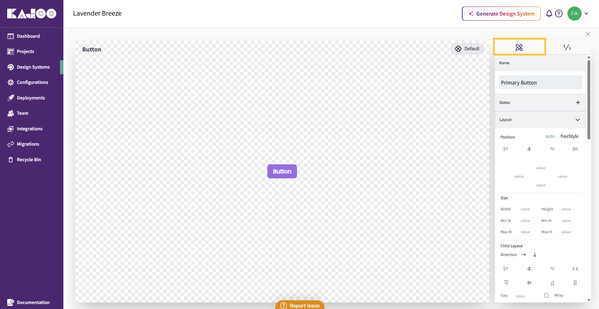
Access the Design tab.
-
Provide a clear, descriptive name for your style variant (e.g., Primary Button, Secondary Heading).
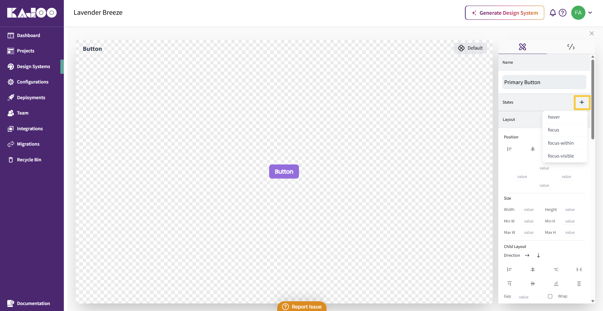
Customize States:
-
Add interactive states such as hover, focus, or focus-within to your style variant.
Customize Styling:
-
Further refine your style variant by modifying visual and layout properties.
-
You can update:
- Layout
- Spacing
- Typography
- Visibility
- Background
- Border
- Flex properties
3. Advanced CSS Optimization:
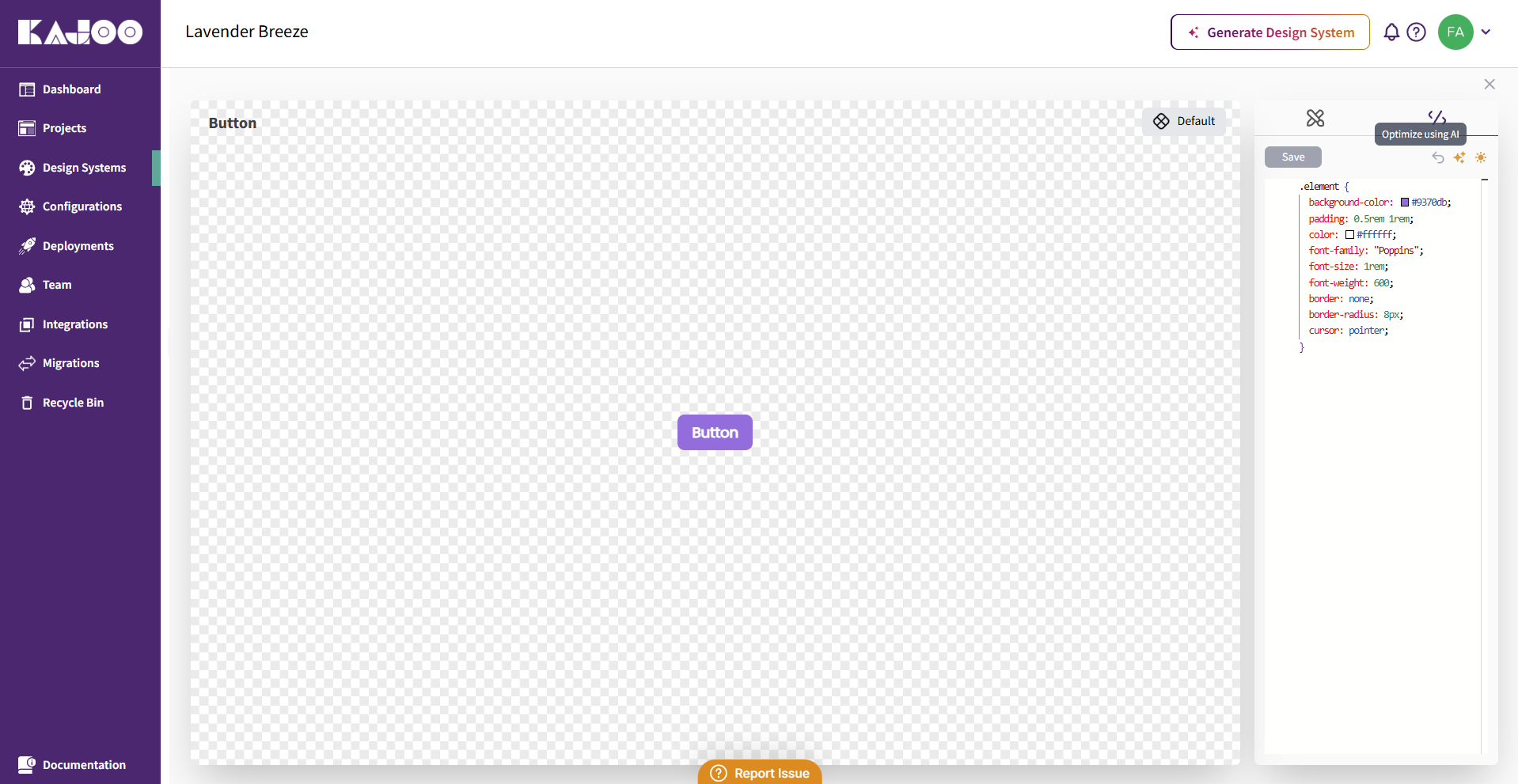
-
Open the Advanced CSS tab.
-
Each style variant corresponds to a CSS class. Customize or extend styles here.
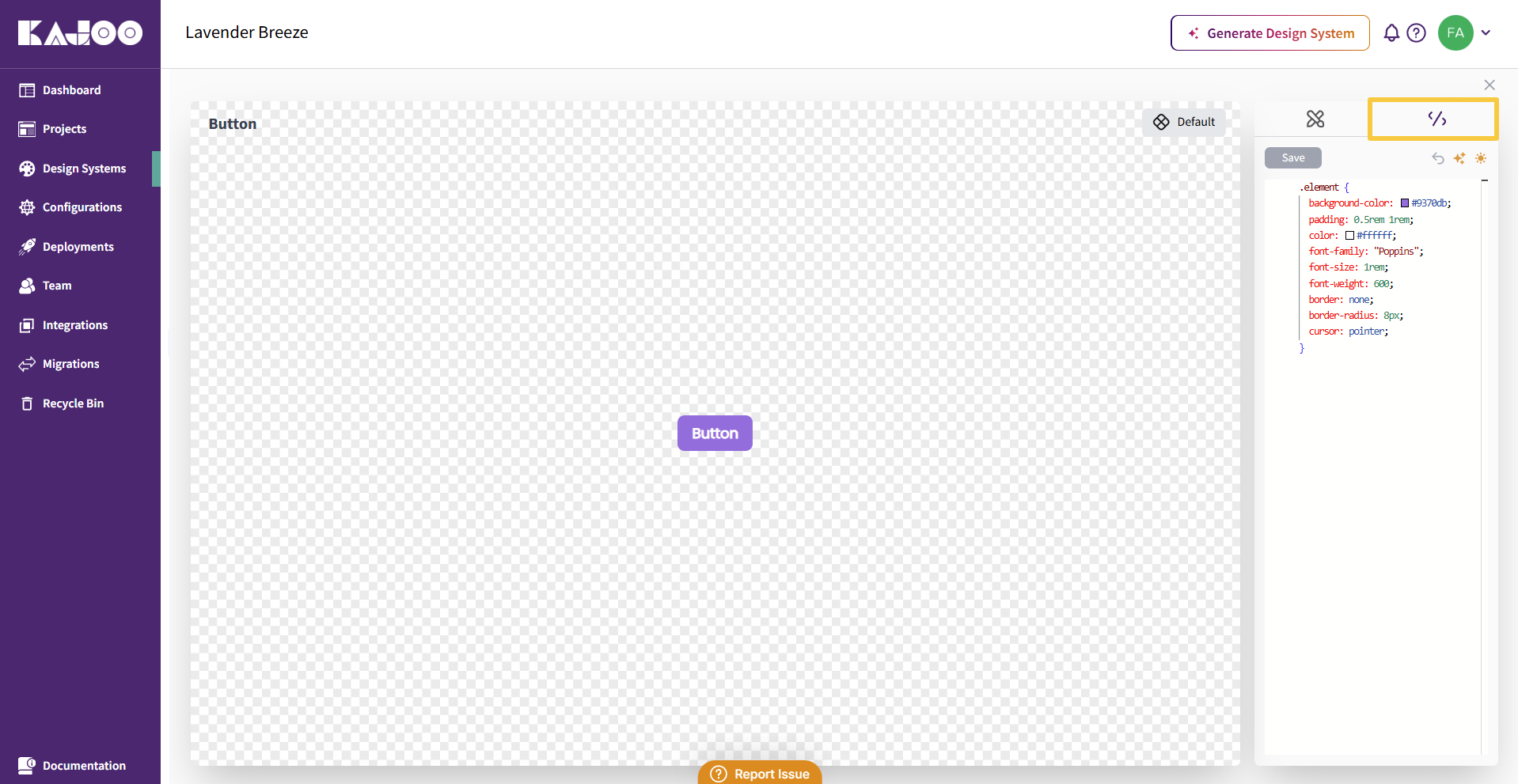
-
Use the Optimize using AI feature to automatically clean and enhance your CSS.
-
Review AI-generated code and choose to Save or Undo as needed.
4. Applying a Style Variant:
-
Once a style variant is saved and set as the default, it will automatically apply when that element type is added to the canvas.
-
Each element type supports one default variant, ensuring a clear and consistent primary style.
Benefits of Style Variants
- Flexibility: Easily define multiple visual treatments for the same element.
- Consistency: Apply the same design rules across similar UI elements.
- Efficiency: Quickly switch styles without rewriting or duplicating CSS.
Updated 7 days ago