

Customizing Your Design System
A well-customized Design System is the foundation of a unified, scalable, and responsive UI. Kajoo allows you to tailor every visual and functional design element — from typography to breakpoints — ensuring your projects look polished and perform consistently across screens.
Below is an overview of the key customizable areas in your design system and the value each brings to your workflow.
📱 Breakpoints
Breakpoints make your design responsive across devices. By defining screen width ranges (e.g., mobile, tablet, desktop), you ensure your UI adapts to various screen sizes without compromising usability or aesthetics.
Simply click on the "Add New" button to add a new breakpoint to your design system.
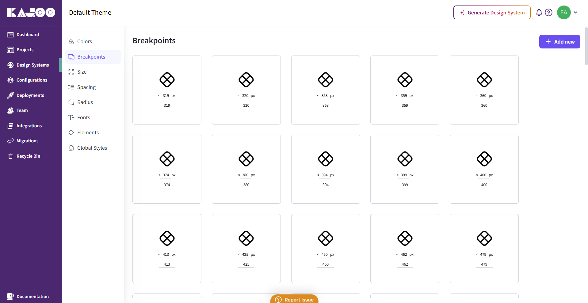
Value: Enables seamless design transitions across screen sizes, improving usability and accessibility on any device.
📏 Size
Size tokens define the width and height of components like buttons, images, or cards. By creating reusable size values, you ensure consistency across your design elements.
You can add a new size token by clicking on the "Add New" button and then enter the name and value for the size token.
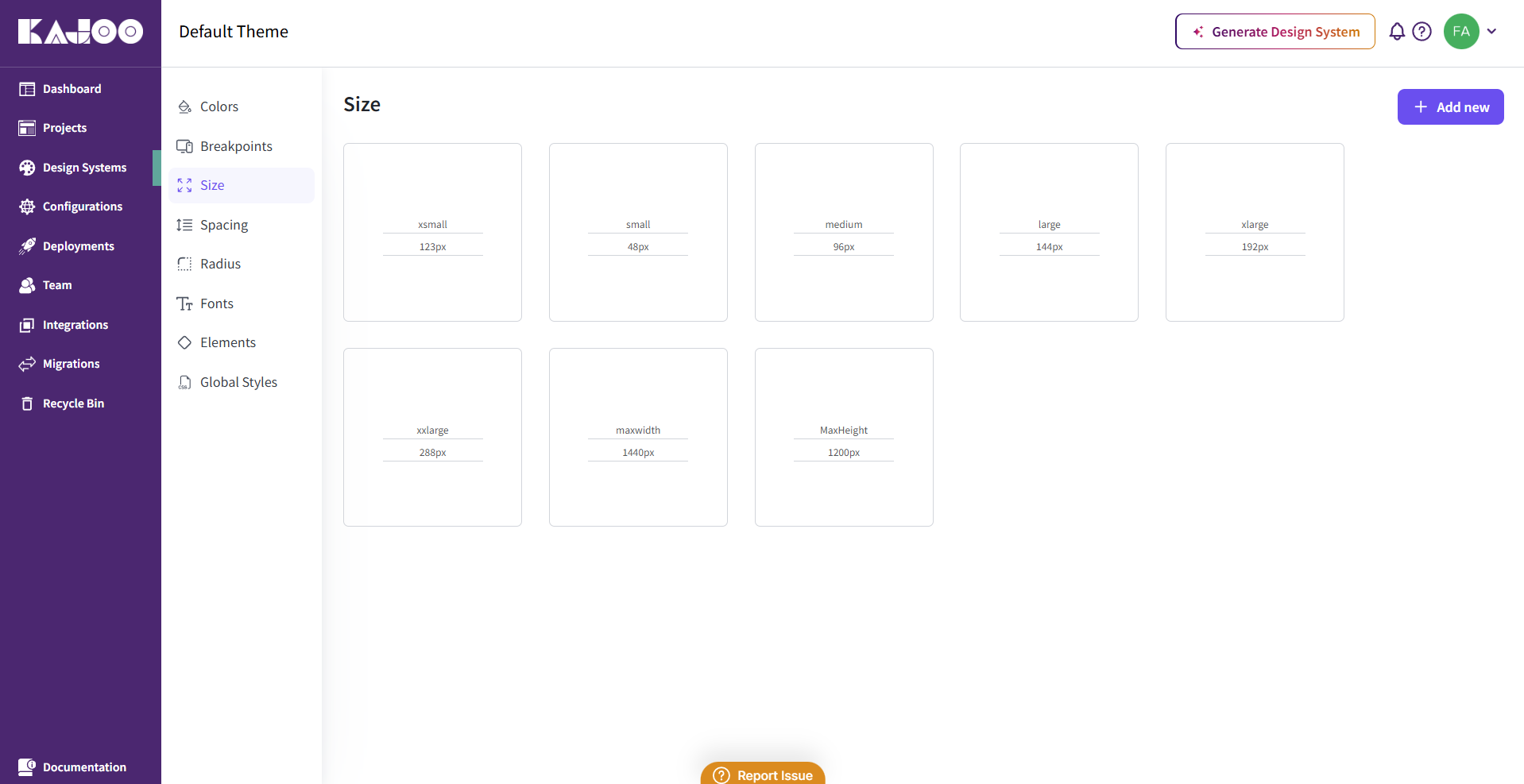
Value: Promotes visual balance and eliminates design inconsistencies caused by manual sizing.
↔️ Spacing
Spacing tokens control margins, padding, and gaps between elements. Proper spacing improves layout clarity, user focus, and visual rhythm. Click on the "Add New" button to add a new spacing token to your design system.
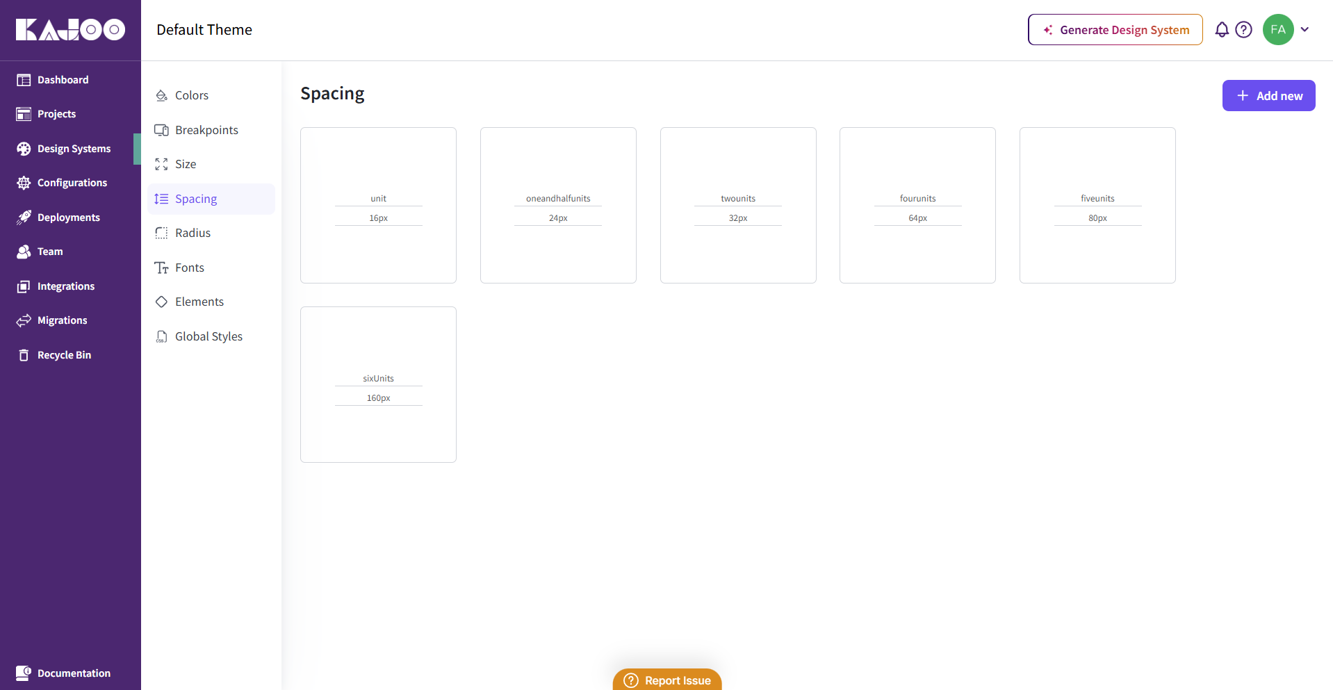
Value: Creates clean, structured layouts that enhance readability and user experience.
🟦 Border Radius
Border radius settings help define the "feel" of your design — sharp and modern, or soft and approachable. Kajoo allows you to set global radius tokens that are applied to buttons, cards, inputs, and more.
Click on the "Add New" button to add border radius to your design system.
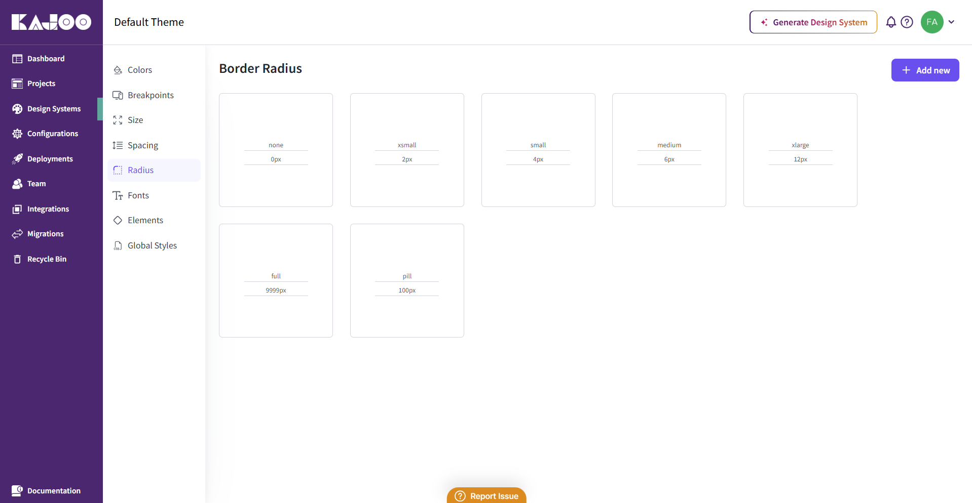
Value: Maintains stylistic coherence across components, while allowing quick design adjustments.
🅰️ Fonts (Google & Custom)
Typography defines the tone of your product. Kajoo lets you add both Google Fonts and custom fonts, ensuring your text aligns with your brand’s identity and visual consistency.
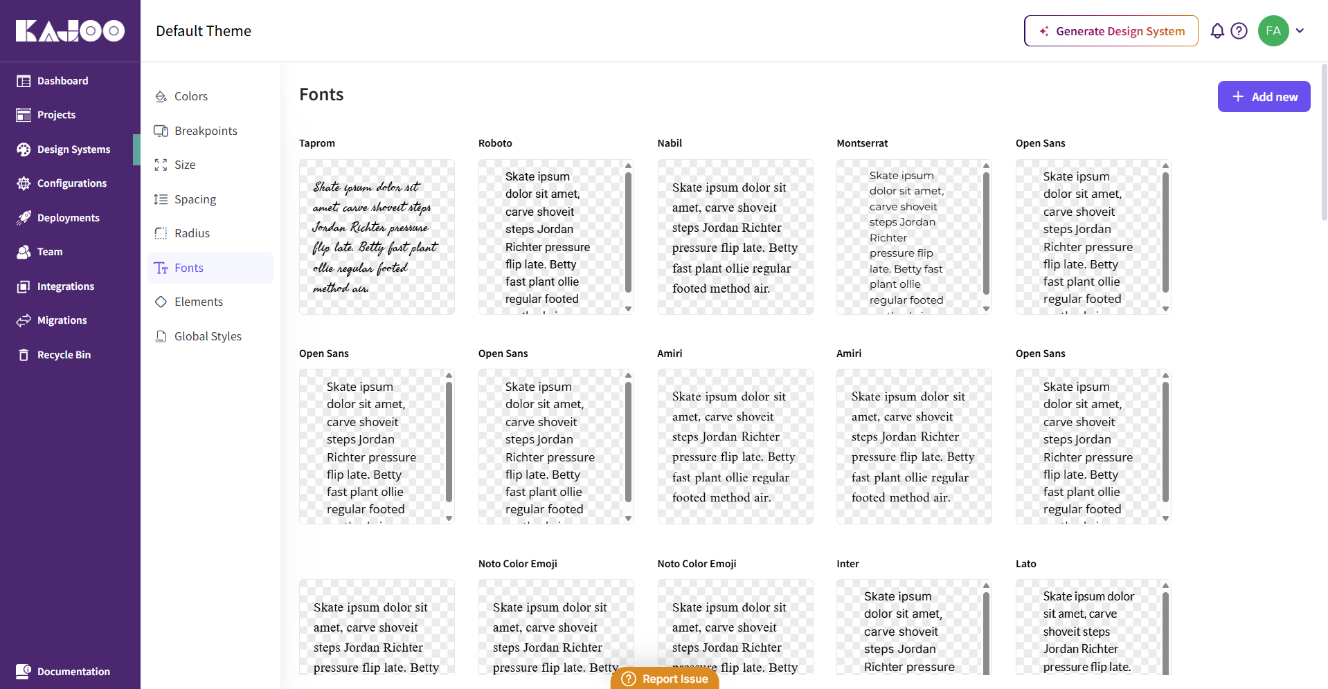
Value: Establishes clear visual hierarchy and branding, while maintaining readability across platforms.
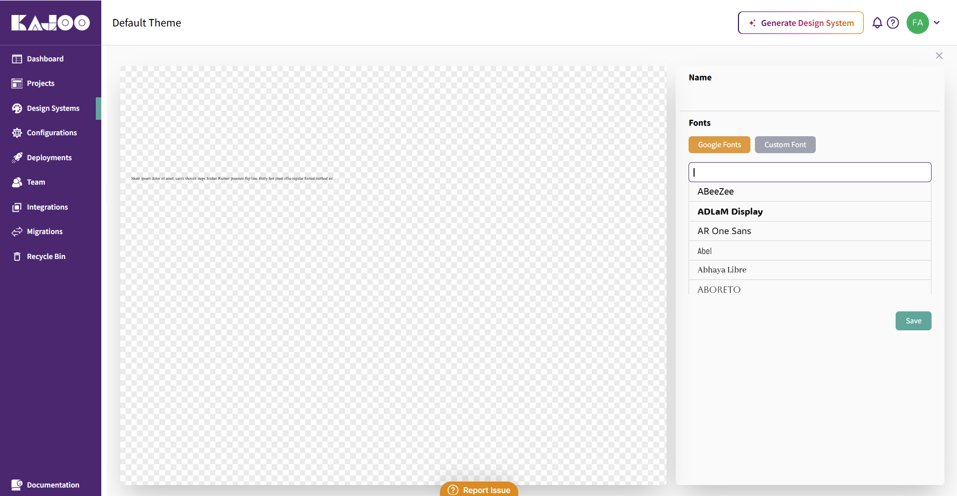
Adding Google Fonts
-
Click on the "Add New" button from the Fonts section.
-
Navigate to the right side of the page where Google Fonts will be selected.
-
Select a google font from the input field and save. The font will be added to your design system.
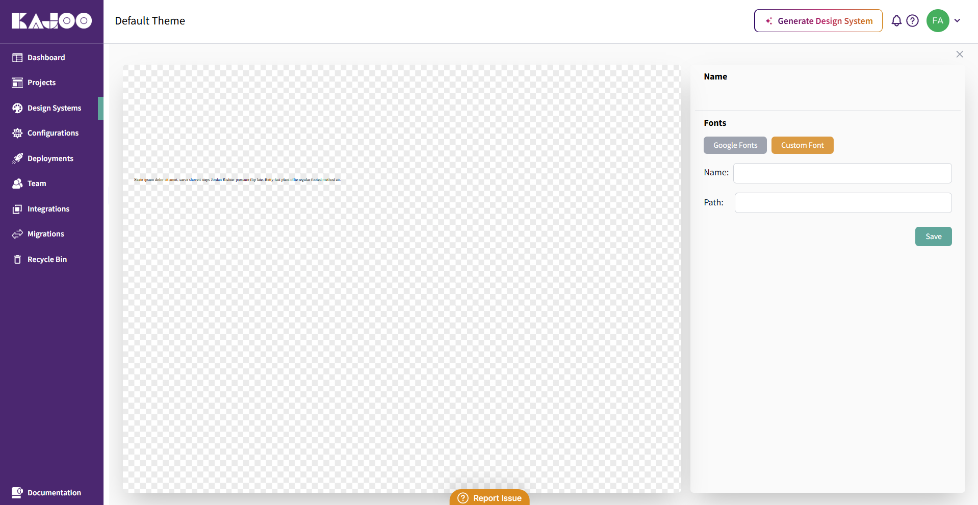
Adding Custom Fonts
-
Click on Custom Font (next to the Google Fonts).
-
Enter the name and path of the font and save.
-
The custom font will be added to your design system.
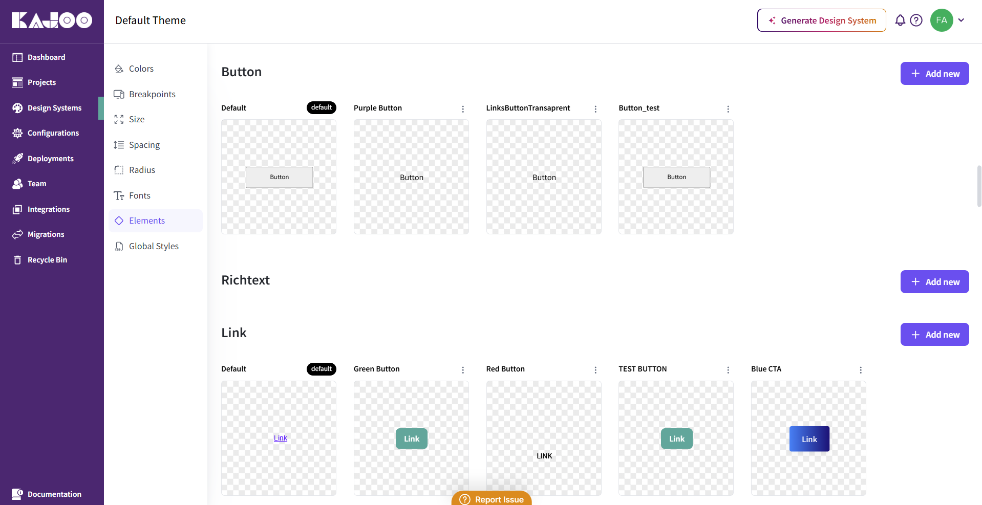
🧩 Elements
The Elements section in Kajoo allows you to define styles for reusable UI components using design tokens such as color, spacing, typography, and radius. This ensures that your interface components remain consistent, flexible, and easy to update across projects.
Important Note: You can add new style variants by clicking on the "Add New" button next to each element. To delete a variant or set it as the default, use the three dots menu beside the variant name. This functionality is available for all element types. For more details on how to define and manage style variants, refer to the Creating Style Variants for Elements section.
Here’s a breakdown of the customizable elements:
🔤 Text
Set typography styles for general text elements such as paragraphs, headings, and captions to maintain a readable and consistent typographic system.
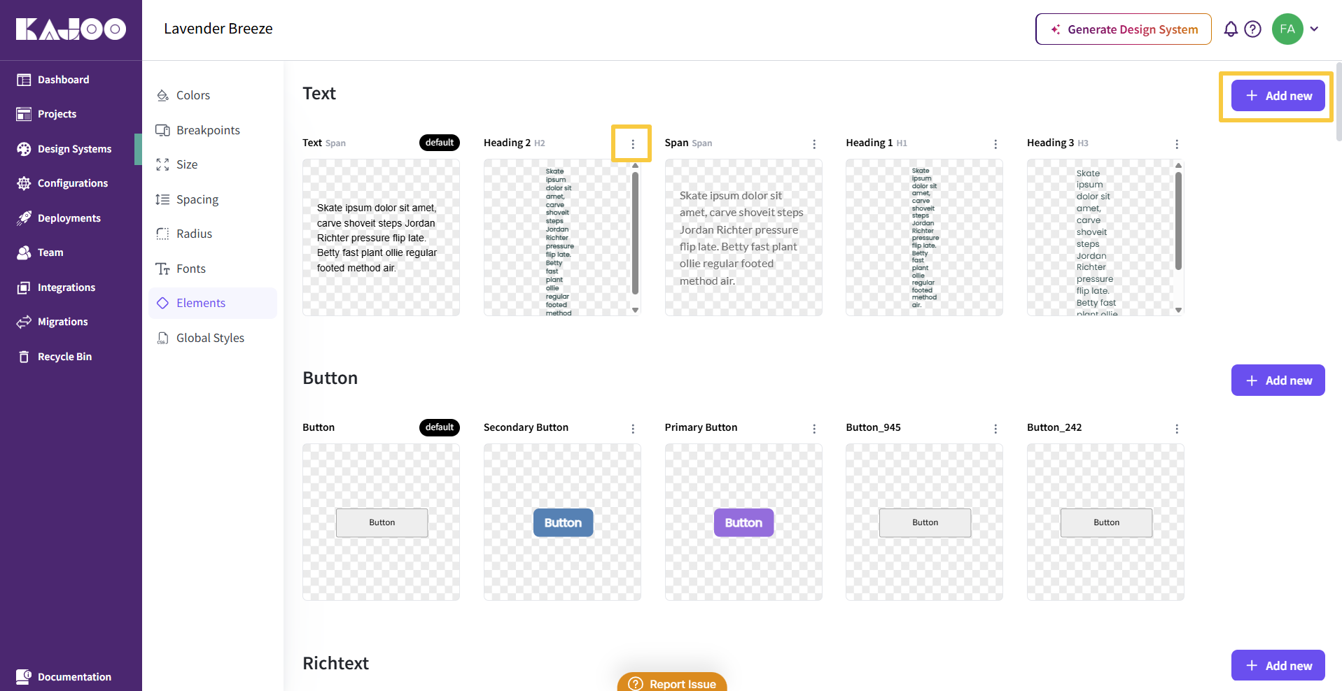
🔘 Button
Customize styles for interactive buttons, including states like hover, active, and disabled. Define color, padding, radius, font, and shadow for a consistent button experience.
📝 RichText
Define the appearance of rich text content (bold, italic, underline, etc.), ensuring styled text is accessible and on-brand throughout your application.
🔗 Link
Style hyperlink elements, including their default, hover, and visited states, to ensure links are visually distinct and accessible.
🖼️ Image
Control the appearance, aspect ratio, and responsiveness of images to maintain visual harmony and fluid layouts.
📹 Video
Customize how video elements appear and behave across devices, ensuring media content is presented consistently and scales properly.
📦 Container
Set dimensions, padding, and alignment rules for containers to control layout structure and component grouping.
↩️ Linebreak
Manage the appearance and spacing of line breaks within text blocks for optimal reading flow and layout control.
🔡 Textinput
Style input fields for text, including font, padding, borders, and states (focus, error), to enhance usability in forms and interactions.
📝 Textarea
Define visual settings for larger input areas, such as comment boxes or message fields, with scalable and accessible styling.
🔽 Dropdown
Style dropdown menus for form selections or navigational choices, ensuring they’re visually aligned with your design system.
🔘 Radio Button
Customize the look and feel of radio buttons, including selected/unselected states, to align with your product’s style.
☑️ Checkbox
Define styles for checkbox components, ensuring consistency with other form inputs in terms of size, color, and interactivity.
🔄 Toggle
Style toggle switches used to enable/disable features, with clear distinction between on/off states for accessibility.
🎚️ Slider
Adjust slider components used for range selections like volume, brightness, or filters, making them intuitive and visually integrated.
📊 Progressbar
Customize progress indicators to match your theme, improving visual feedback for loading states or task completion.
🧾 List
Define the appearance of ordered and unordered lists to ensure they are legible, well-spaced, and consistent throughout your app.
Value: Customizing these elements within your design system helps build a UI that is both cohesive and scalable. Every component inherits your design tokens, making changes faster and more reliable across all your projects.
In the next section, you will learn how to create style variants and customize styling.