
Creating a Component Variant and Customizing Styling
What Are Component Variants?
Component variants enable you to define multiple styles for a single component type. For example, a button component could have different variants for primary, secondary, and tertiary buttons, each with unique colors, sizes, and states (e.g., hover, focus). By creating variants, you ensure flexibility and consistency across your design system.
How to Create Component Variants
1. Select a Component:
-
Choose the component you wish to style (e.g., a button or text element) from your design system’s component library.
-
In the component editor, you can create a new variant.
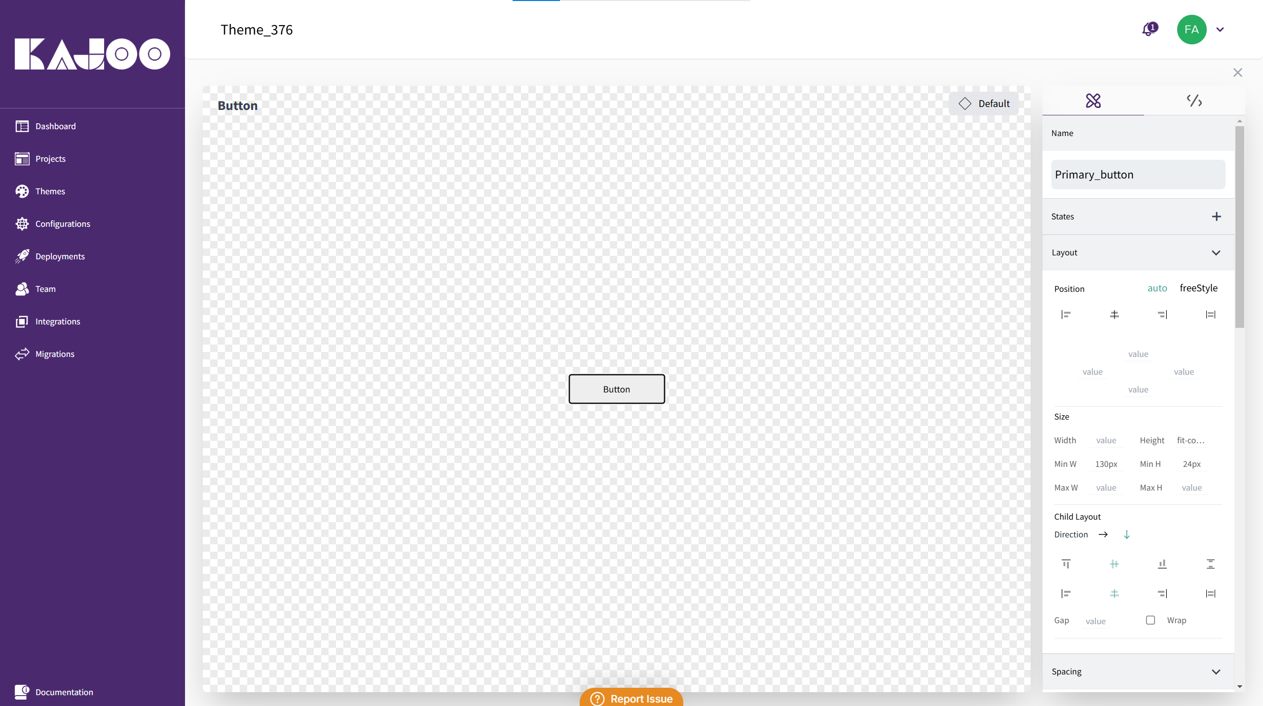
2. Creating a Variant:
Define the Variant Name:
- Give your variant a unique name (e.g., Primary Button or Secondary Heading).
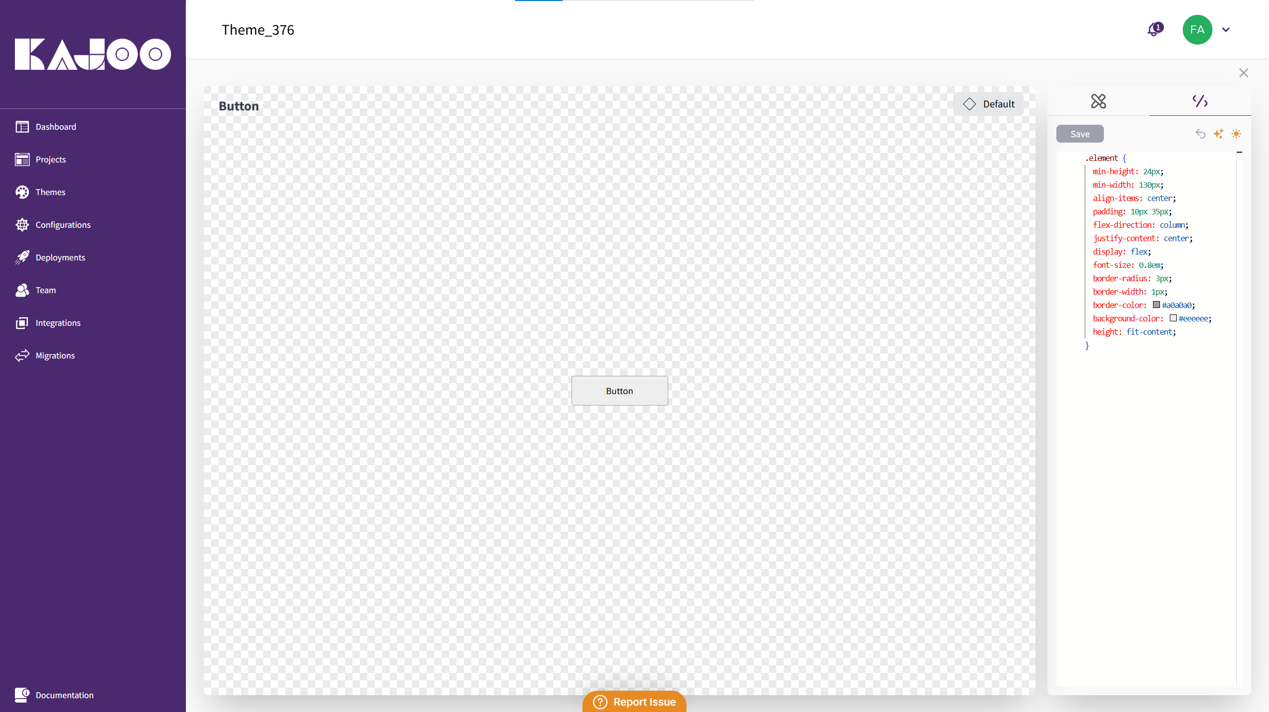
Custom CSS Classes:
-
Each variant corresponds to a CSS class. Add your custom styling in the variant editor.
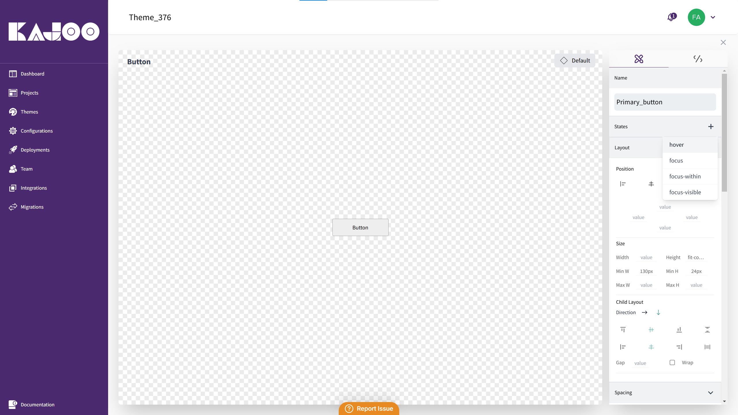
Customize States:
-
Add different states such as hover, focus or focus-within.
-
For example, for a link variant that converts to a button, copy the button CSS, paste it into the link’s variant, and modify states like hover to change colors (e.g., turning yellow on hover).
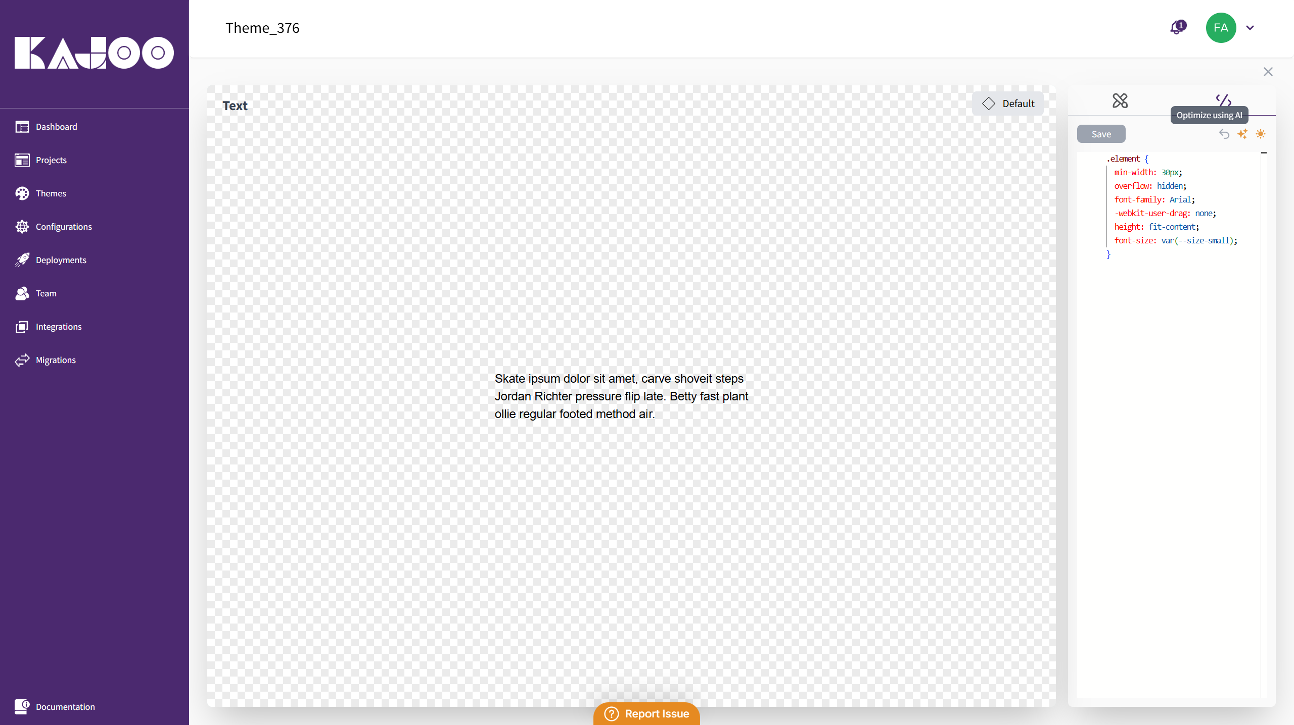
3. Advanced CSS Optimization:
-
Use the Optimize using AI feature in the Advanced CSS tab to refine and clean up your CSS code.
-
Preview the AI-optimized code and choose to save or undo the changes if necessary.
4. Applying the Variant:
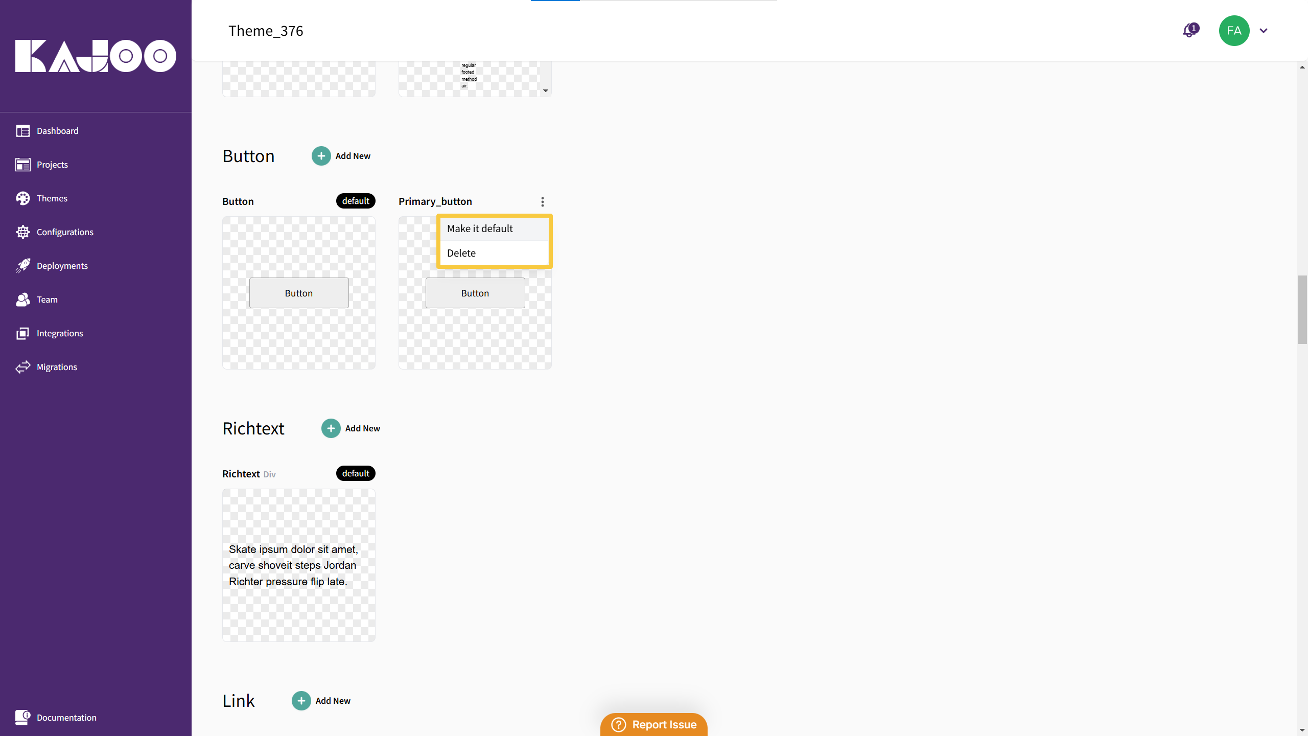
-
Once a variant is created and set as default (if desired), it will automatically apply to the corresponding component when dragged and dropped into the canvas.
-
Only one default variant is allowed per element type, ensuring a clear primary style.
Benefits of Component Variants
- Flexibility: Easily create multiple design options for the same component type.
- Consistency: Ensure similar elements across your app adhere to the same design principles.
- Efficiency: Quickly switch between component variants without rewriting CSS each time.
Updated 9 days ago