
Customizing Your Theme in Kajoo
This user guide provides instructions on how to customize your Kajoo theme effectively. It covers how to add and configure essential elements such as color palettes, breakpoints, and fonts, ensuring your design system is cohesive and adaptable. Additionally, it outlines other key theme settings to help you fine-tune various UI components and create a personalized user experience across devices.
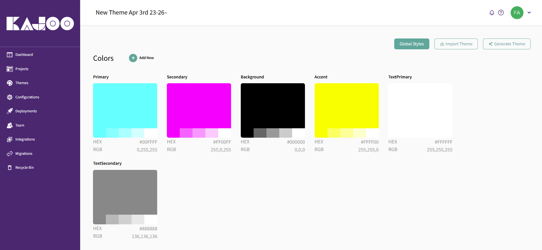
Adding Color Palettes
In Kajoo, color palettes are integral to your design system. You can define primary, secondary, and tertiary color schemes, as well as any additional shades you might need. By creating a defined color palette, you ensure that your design system stays consistent in its color usage.
How to Add a Color Palette:
-
Navigate to the "Colors" section within your theme editor.
-
Define colors by their HEX, RGB, or HSL values.
-
Assign colors to different elements like buttons, links, or backgrounds.
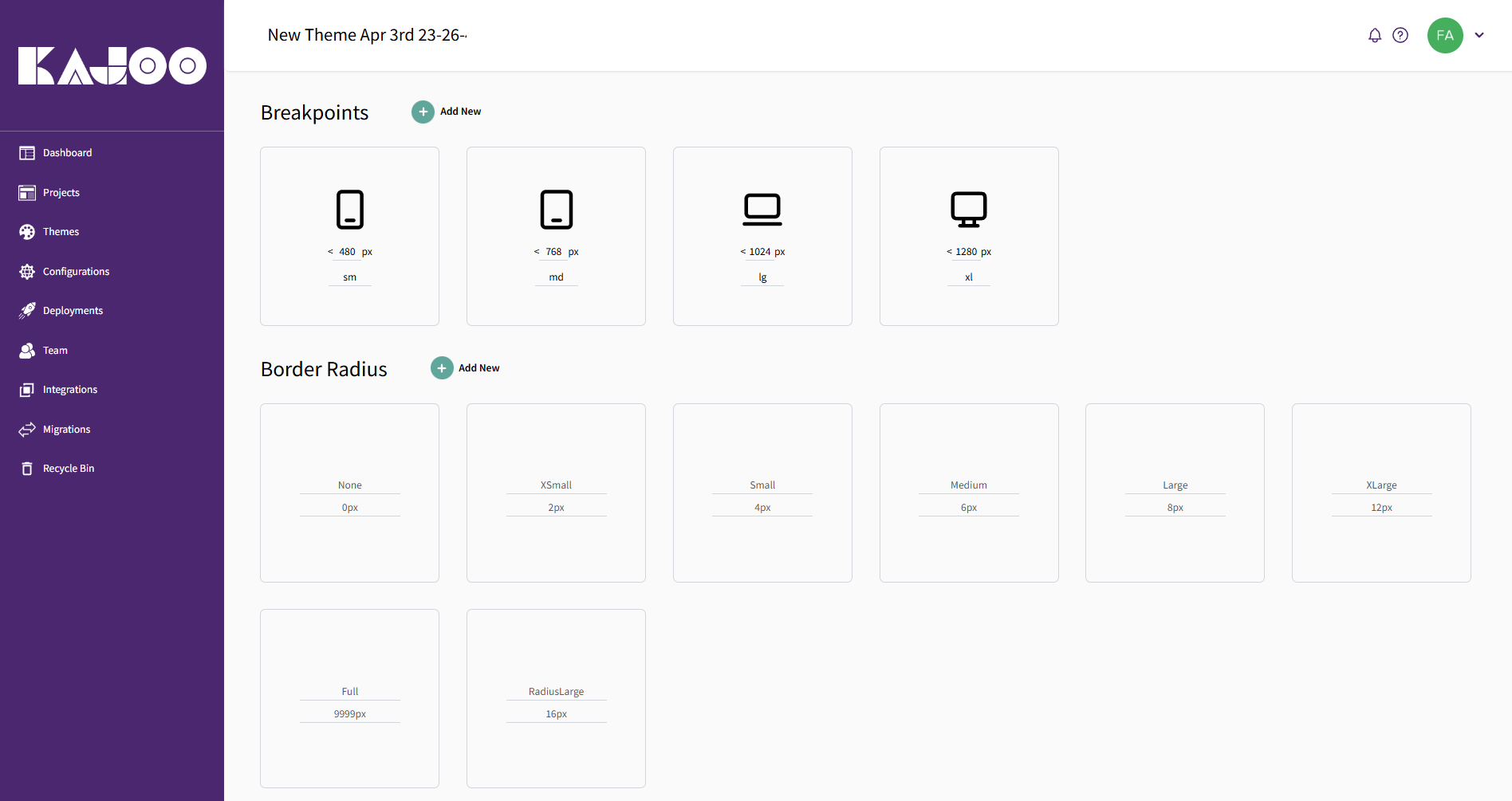
Defining Breakpoints
Breakpoints allow you to adapt your design system to different screen sizes. By setting breakpoints, you ensure that your design is responsive and looks great on all devices, from mobile phones to large desktop monitors.
How to Add Breakpoints:
-
In your theme settings, define breakpoints based on your desired screen sizes (e.g., mobile, tablet, desktop).
-
Use these breakpoints in your CSS to apply different styles for different screen sizes, ensuring your app adapts to all devices.
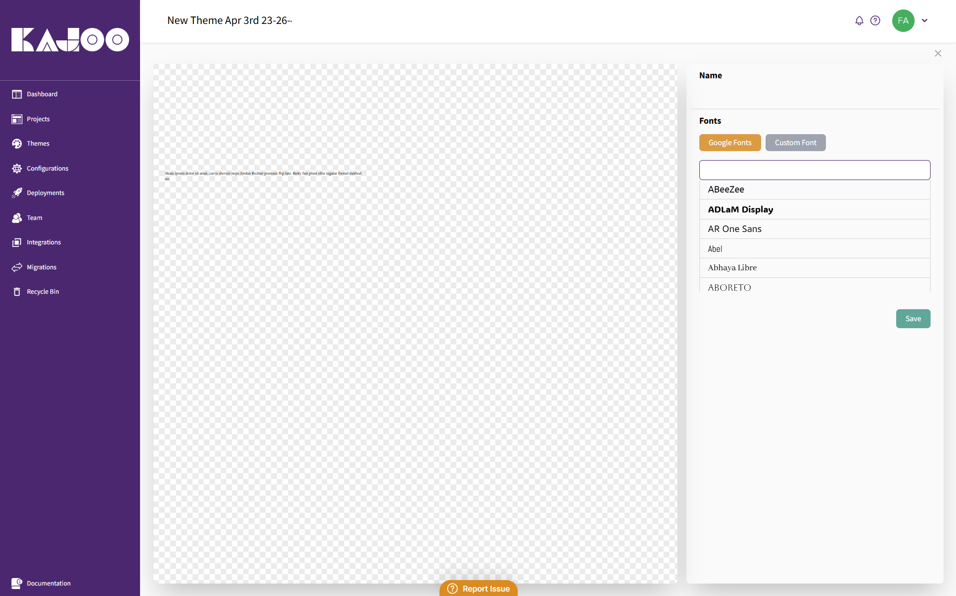
Adding Fonts (Google and Custom)
Typography plays a vital role in creating a visually cohesive design system. Kajoo allows you to use both Google Fonts and custom fonts to ensure your design aligns with your branding.
How to Add Fonts:
-
Google Fonts: Select and integrate Google Fonts directly into your theme editor.
-
Custom Fonts: Upload custom font files (e.g., TTF, OTF) and define their usage across various elements in your design system.
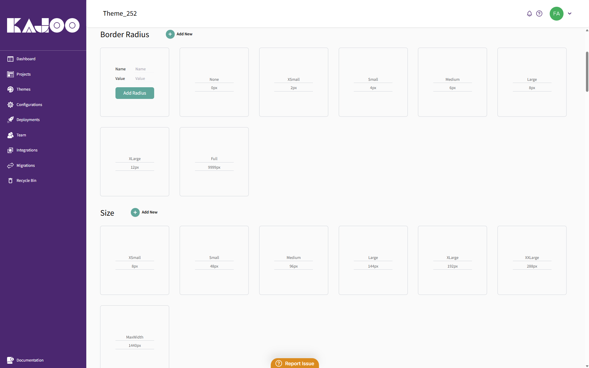
Other Theme Sections
-
Border Radius: Adjust the curvature of elements' corners for a rounded or sharp look.
-
Size: Define the size of elements across different devices to maintain proportion.
-
Spacing: Control the spacing between elements to ensure a balanced layout.
-
Text: Set the typography styles for general text elements, such as paragraphs and headings.
-
Button: Customize button styles for interaction, including hover and click states.
-
RichText: Define the appearance of rich text elements like bold, italic, and other text formats.
-
Link: Style the links within your theme, including hover and active states.
-
Image: Control the appearance and responsiveness of images in your theme.
-
Video: Style video elements and ensure they adjust properly to different screen sizes.
-
Container: Define the container size and layout for different sections of your theme.
-
Linebreak: Control the spacing and appearance of line breaks within text blocks.
-
Textinput: Customize text input fields for forms and other user interactions.
-
Textarea: Define styles for larger text areas, like comment boxes or descriptions.
-
Dropdown: Style dropdown menus for consistent and easy-to-use navigation.
-
Radio Button: Customize radio button styles for selection inputs.
-
Checkbox: Style checkboxes to match your theme’s overall design.
-
Toggle: Customize toggle switches for activating or deactivating features.
-
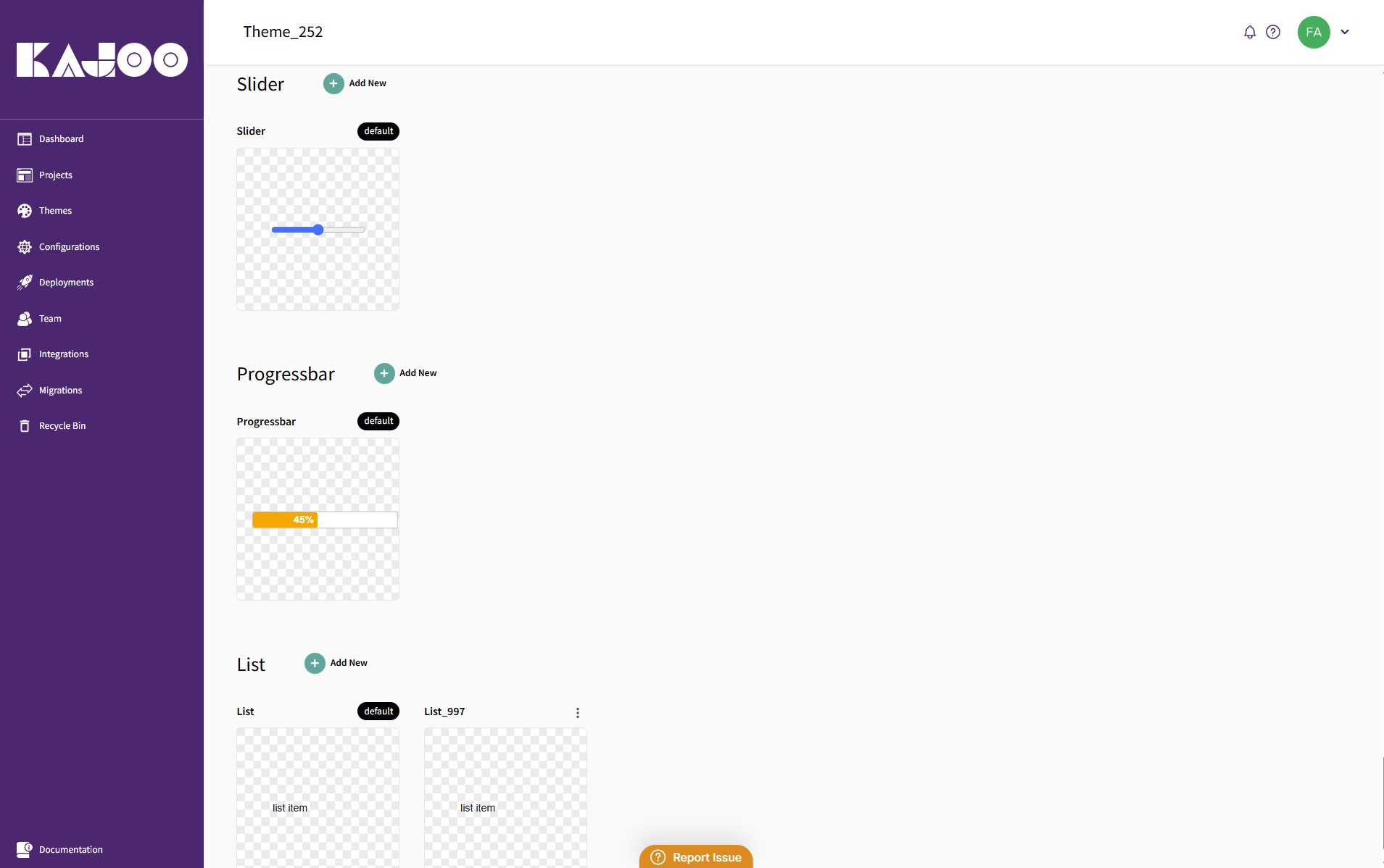
Slider: Style sliders used for input values, like volume or brightness.
-
Progressbar: Adjust the appearance of progress bars to indicate loading or task completion.
-
List: Customize the look of ordered and unordered lists throughout your theme.
Updated 7 days ago